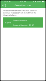
Redesigning Toronto’s Green P parking app!

The objective here was to pick a company with a digital product and help better their digital experience. Using Jakop Nielson’s Usability Hueristics, we were able to identifiy usability issues and then present a redesign.

As a user of the Green P app who struggled with its usability, I felt the need to propose this to my team members and they accepeted the challange! We began with evaluating the applicationg, noting the usability issues and then reading user reviews from the App Store, Play Store and Facebook. 

Collaborators: 
Simon Leung & Niko Victorino


Original Design

We decided to pick the task of paying for parking and focus on the primary screens.  As a user of the app, I was aware of some usability issues and having a team member who’s first time time using it provided us with a new-user perspective. We conducted the heuristic evaluation based on five heuristics. 

Aesthetics and Minimalistic
Design Match Between System and Real World
Recognition Rather Than Recall  
User Control and Freedom
Error Prevention

Heuristic
Evaluation

Aesthetics and minimalistic design

1. Redundant text, “Location ID” is mentioned three times which includes two helper texts.

2. Hierarchy issues with location ID & Mobile Pay Sign

3. Terms and conditions included an extensive amount of text


Match between system and real world

4. There is unfamiliar language being used the word “Citation” can be confusing to the audience


Recognition rather than recall

5. Unclear instructions how to use the “Green sticker/logo”

Aesthetic and minimalist design

1. Information not made prominent, useful but not emphasized.

2. “Location information” is irrelevant as it provides no value to users who are unfamiliar to the area.

3. No visual difference between Car Choice and Add Vehicle


User Control and Freedom

4. No edit function for vehicle selection


Recognition and recall

5. Parking information forces users to recall information about the location

Aesthetics and minimalistic design

1. Hierarchy issues, no distinct differentiation between buttons

2. Options can cause confusion based on overlapping time.
(Causing the user to question: which option should i choose? Do I need to pay twice?)


Recognition rather than recall

3.Parking info forces users to recall information (Vehicle, Parking zone)

4.Text paragraph is repetitive, would make the user reread it in case of any changes 

Aesthetic and minimalistic design

1. Instructions indicated don’t provide apparent payment options

2. No other payment methods available once it has been inputted

3. Confusion between PayPal & GreenP account
 

Recognition rather than recall

4. No clear indication of Parking information, forces users to recall Vehicle & Parking info

Aesthetics and minimalistic design

1. The modal box is too small for the amount of information

2. Excessive text causes information to be hard to read

3. No text hierarchy


User control and freedom

4. “No & Yes” are dismissive actions as it provides an answer to the  question but does not suggest what will happen afterwards therefore limiting what the user can accomplish.

2/5 Match between system and the real world
Use of jargonLarge paragraphsUser languageLogical order/ user flow

2.5/5 Aesthetic and minimalist design
Irrelevant information
Visibility of information is inconsistent

0/5 Control and freedom
No undo's for payments
No parking time alterations

2/5 Error Prevention
License plate errors are user’s responsibility.
Not forgiving user makes mistake
Use of text versus visuals for information proves to be an issue

0/5 Recognition and recall
Does not tell you where you are parking in a simple manner
Does not provide necessary information on each page

Total 6.5/25

User Reviews

Understanding what works prevents us from changing a design that users enjoyed and found useful. Furthermore, the reviews provided great insight in understanding the users needs and pain points that they had experienced. 

Redesign

The redesign provides a better solution that focuses on the needs of the users, usability and overall providing a plesant experience.

Original Design

1. Clear and consice intructions on how to use the “Location I.D sign.”

2. Larger signage for real world identification.

3. Terms & Conditions were added separately as an alert so that the user only has to read it once.

4. Static disclaimer was replaced with actionable terms. 

Original Design

1. Emphasized visual map information so the user can clearly see the area of parking they are paying for.

2. Included an “Edit” function which allows users to make changes to their vehicles.

3. Created visual hierarchy by emphasizing cars already listed and differentiating with “Add New Vehicle?”

Original Design

1. Show previous information so the user does not have to recall from memory.

2. Improved hierarchy between the visual map, information and buttons.

3. Provided common parking durations and a customizable feature.

Removed heavy text.

Original Design

1. Included the total amount to be paid on the screen.

2. Included all payment methods and created a differentiation among the options to avoid confusion 

Original Design

1. Allows the user to clearly view the information they have inputed.

2. Editing feature has been included to make any changes.

3. Actionable buttons have been added to replace “No & Yes.”

4. “30 seconds Cancel” option has been included incase change of mind or error.

5. Receipt page for reconfirmation of the parking paid including the option to E-mail recipt.

Feedback and Insight

This project provided a great opportunity to work together as a group, learning about our strengths and how to use them to come up with a solution. After our presentation of the redesign, we received a lot of positive feedback towards future changes. It was crucial to clearly state the usability issues, how it can affect the users' experience and how the redesign makes the experience better.

On a personal note, I enjoyed completing this exercise as I got to work closer with my colleagues to further analyze usability issues, how to improve them and learning about the value of usability.

And the cherry on top, the enthusiasm we received from one of the audience members. She was a user of the GreenP app who experienced the struggle and we were the ones who understood the pain. She expressed how the redesign is much better and useful! Furthermore, validating our work.